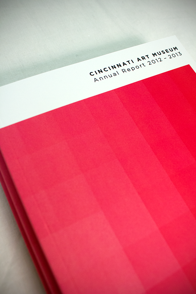
Annual report designed for the Cincinnati Art Museum. Perfect bound to allow the covers to have a seamless transition and uniform quality.
Don's Locksmith Service
Business card for a locksmith based out of Calvert City, KY. Additional images show my process.
Notations
Notations is a yearly published collection of art and literature featuring selected artwork, fiction, non-fiction, and poetry of Murray State University students. The English and Art departments collaborate to design and edit the project.
Indawgnito
Managed the creation and design of Indawgnito.
Indawgnito is a delightful game about cute dogs that wear clothing. In addition to the fun factor, this game helps strengthen deduction and memory skills for all ages!
Seasonal Posters (Target)
Halloween (Target)
A set of four posters I designed for Target's 2015 Halloween season.
Graduation (Target)
Hand-Lettering. Colorful Squiggly Illustrations.
Print design purchased by Target for the 2016 Graduation season.
Burgers!
Managed the creation and design of Burger Pile-Up.
Avoid a messy collapse while you race to stack your burger parts in (ascending) numerical order. Using equal parts luck and strategy, the player with the highest burger tower wins!
Swiss Peaks
Swiss style. Twin Peaks.
Two Swiss designed posters with Twin Peaks as their subjects. Colors and glyphs combine to reflect the scene and setting with quotes as added flavor text.
Random Products
Managed the creation and design of several products that sold to Target, Walmart, Five Below, Dollar General, Dollar Tree, Aldi, and many others. Here are just a few examples!
Left of the Dial
'80s Noise. Radio Dial. Reagan-era Jams.
Logo design for WKMS (Murray State's NPR Station).
The show is heavily rooted in the underground music scene of the 1980s. Artists like The Smiths, The Cure, New Order, David Bowie and Depeche Mode form the substratum of LEFT OF THE DIAL, but you're guaranteed at least a couple Reagan-era jams every week that you've never heard of before.
Café Philip Kindred Dick
Minimal design intended to craft the brands voice and customer experience for the modern generation of café enthusiasts. The brand encompasses a lunch menu, graphic standards manual and several pieces of collateral.
Café branding based on the American novelist Philip Kindred Dick.
Website redesign for The Water Project. Large photography to invoke emotion. The Water Project is designed to bring water aid to the communities in sub-Saharan Africa.
Swiss inspired print advertisement designed to replicate the early 1980s travel ads such as National Geographic. This particular advertisement was created to increase travel frequency to Québec during its winter months.
G's Comics
Website designed for a comic shop in Murray, Kentucky. Simplistic and monochromatic fixed position navigation to contrast the vibrant and colorful comics that are displayed on the site.